Streamlining Compliance Workflows at Guidant Financial
2019 • UX Design
Redesigning Guidant Financial’s data-heavy compliance portal to improve usability, resolve technical issues, and rebuild user trust.
Challenge
Guidant Financial has enabled over 30,000 entrepreneurs to secure funding and maintain business compliance through their one-stop-shop platform. A few years after scaling and transitioning from a legacy platform, the product faced significant technical debt, design inconsistencies, and performance issues, resulting in record-low customer satisfaction. To address these issues, I conducted multiple rounds of qualitative research, uncovering key pain points and driving a cross-functional effort to build user empathy and redesign the platform for a more intuitive and user-friendly experience.
To address surface-level insights from surveys and support calls, I organized usability sessions to uncover deeper issues. Using a custom recruiting process through Salesforce, I targeted engaged users with diverse business complexities and conducted remote Zoom sessions to observe them in their working environments (this was pre-Covid). By involving stakeholders across the company in live sessions and post-analysis, we bridged the empathy gap, accelerated learning, and shaped a more user-centered design direction.
I ran an affinity diagramming session with stakeholders to analyze user feedback and uncover key issues. Users struggled with confusing upload requirements, frequent errors, and rigid processes that caused unnecessary submissions. The annual nature of the process left them feeling unsupported, with unclear guidance. Using these insights, I sketched initial concepts to address their challenges.
Goal
To make this project a success, I needed to revamp the experience to meet diverse user goals while reducing unnecessary rigidity. Clear guidance and streamlined support paths aimed to empower users to self-serve and rely less on customer support. Efforts focused on simplifying complex tasks, like conditional flows and the file upload process, to make them more accessible. The goal was to balance clarity and flexibility, adapting to user needs without adding complexity.
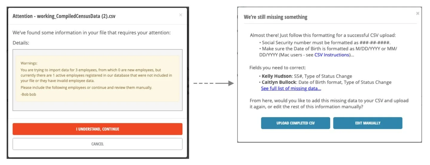
Improving what appears as a simple step in a complex process played out over several screens, modals, and conditional states.
The home screen was previously confined to a modal, preventing users from returning once they moved forward. I relocated the starting screen to the main window and improved navigation by refining the hierarchy, headers, and buttons, and added tooltips and instructions to make contextual help more accessible.
I improved error messages by making them actionable and allowing re-uploads directly in the dialog. Errors now highlight specific fields needing correction in clear language. I redesigned the upload dialog for a cleaner UI and clarified the “Upload Success” message with the next step highlighted.


